

12 Copy Ready Ecommerce Ad Creatives Marketers Can Pretest to Convert
Prioritize three things right now: short product first video under 30 seconds, real customer proof (UGC video for ecommerce beats polished brand film almost every time), and running enough creative variants to actually learn something. Everything else, from carousel structure to platform-specific sizing, is optimization on top of that foundation. The rest of this guide gives you the templates, the platform mapping, and a testing framework that turns those three priorities into a repeatable system.
TL;DR:
- Short product-first videos under 30 seconds, UGC testimonials, and carousel formats consistently outperform longer, polished brand films in ecommerce ads.
- Testing new creative variants in separate ad groups and refreshing every 4 to 6 weeks helps prevent creative fatigue and improves overall performance.
- Uploading multiple aspect ratios and making on-image text large and high-contrast maximize ad visibility across different platforms and devices.
- Using AI tools for pre-testing and generating diverse creative variants can boost CTRs by approximately 14% and reduce wasted budget on ineffective ads.
- Ad creative should pair visual proof points with clear CTAs and focus on quick, impactful demonstrations rather than static claims or long formats.
Table of Contents
- What Makes Great Ecommerce Ad Creatives? Ideas You Can Steal Today
- What Design and Messaging Rules Actually Lift Performance?
- Which Ad Formats Work Best on Each Platform?
- How Do You Test Ad Creatives Without Wasting Budget?
- Copy-Ready Ad Recipes by Ecommerce Category
- Pre-Launch Checklist for Ecommerce Ad Creatives
- Why Creative Velocity Beats Chasing One Perfect Ad
- Test Your Creative Before You Spend the Budget
- Sources
- FAQ
What Makes Great Ecommerce Ad Creatives? Ideas You Can Steal Today
You don’t need a production budget to build strong ecommerce ad creatives. You need a bank of formats you can shoot fast, test cheap, and swap out before they go stale. Here are twelve concepts worth building into your next batch:
- UGC hook: a customer talks straight to camera for 5 to 15 seconds about the one thing that sold them.
- Unboxing highlight: a 6 to 20 second vertical clip or carousel that lingers on packaging and first impression.
- Product-in-use micro-demo: 10 to 30 seconds showing the result, not the process.
- Before/after transformation: the contrast has to land in the first three seconds or the scroll wins.
- Founder or maker pitch: 10 to 15 seconds of an actual person explaining why the product exists.
- Looping hero shot: a 3 to 8 second seamless loop of the product detail, built for feed placements.
- Carousel story: step-by-step use case or a lineup of SKUs, one card per idea.
- Countdown badge overlay: a limited-offer visual with urgency baked into the creative, not just the copy.
- Lifestyle scene with a clear CTA: show the product in the life the buyer wants, then tell them what to click.
- Packaging-as-experience: treat the unboxing itself as the hook, especially for gifting or subscription products.
Each of these works as a standalone test, not a campaign centerpiece. Build small, test often, and let performance tell you which concept deserves a bigger budget.
What Design and Messaging Rules Actually Lift Performance?
Show, don’t tell. That single rule separates ecommerce ad creatives that convert from ones that just look nice. If your product removes a stain, show the stain disappearing. If it saves time, show the clock. Static claims in a headline rarely do the work that a three-second visual demonstration does.
Hook timing matters more than most teams think. Keep most video creative under 45 seconds overall, and for social placements specifically, aim for 15 to 30 seconds. That range consistently outperforms longer formats because short ecommerce video ads hold attention better than long-form content, and the first one to three seconds decide whether anyone sees the rest.
Social proof isn’t optional anymore. Overlay a short review quote directly on the product image, or cut in five seconds of a real customer talking. It reads as more credible than any brand copywriting you could write yourself.
A few more rules that consistently move the needle:
- Upload square, vertical, and landscape versions of every creative. Don’t rely on one aspect ratio to render correctly everywhere.
- Keep on-image text large and high-contrast. Most people are viewing on a phone screen, often in bright light or while walking.
- Make your CTA match your landing page. If the ad says “Shop the Sale,” the landing page headline should say the same thing.
Pro Tip: Write your on-image text as if the sound is off and the screen is six inches across. If you can’t read it at a glance on your own phone, your buyer won’t either.
Which Ad Formats Work Best on Each Platform?
Format choice isn’t a style preference. It’s a mechanical fit between what you’re selling and what the placement was built to do.
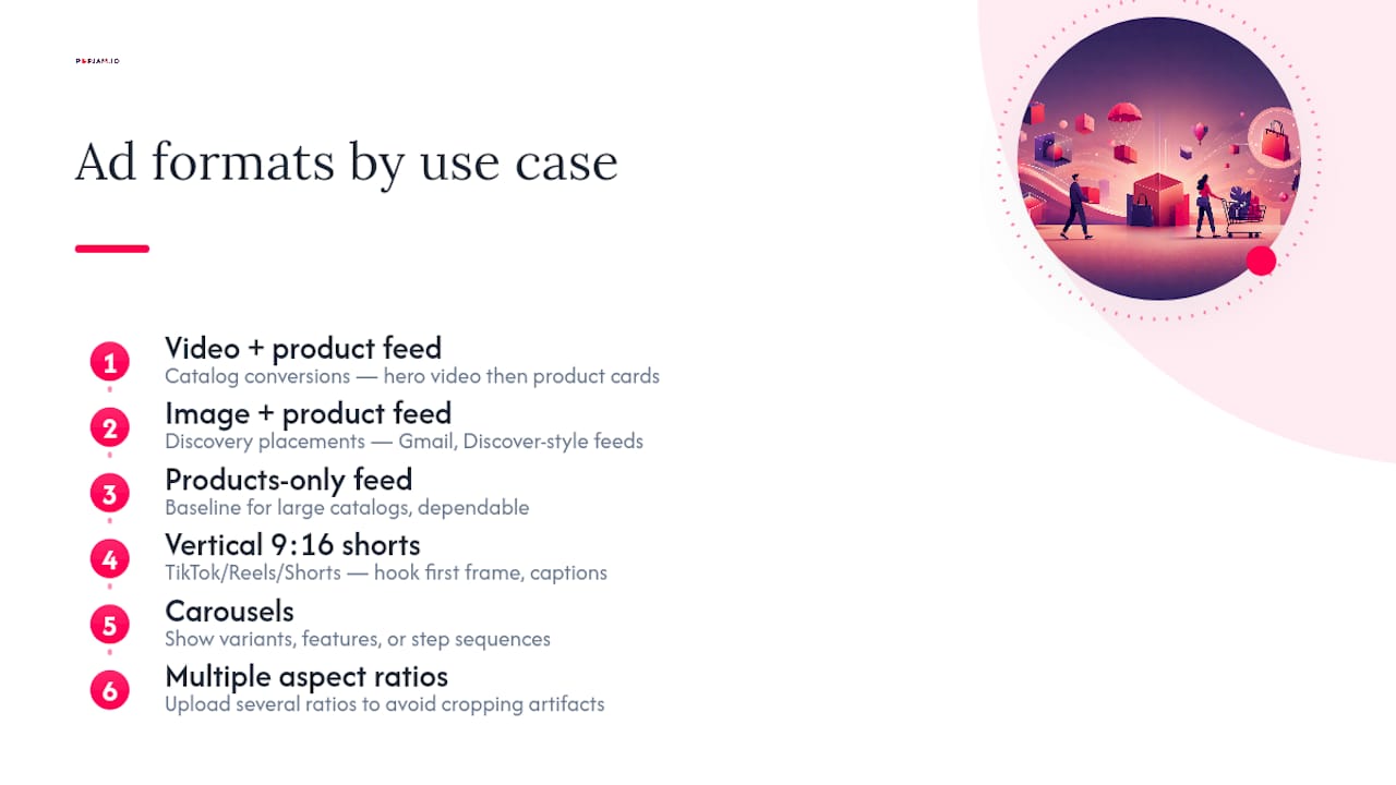
Video paired with a product feed performs best for catalog-led conversions. A short hero video builds interest, then product cards right below it turn that interest into a click. This pairing tends to lift conversion because shoppers get the emotional hook and the practical “here’s exactly what to buy” moment in the same unit.
Image paired with a product feed works well for discovery placements, including Gmail and Discover-style feeds, where users are browsing rather than actively shopping.
Products-only feed is your baseline. It’s not exciting, but it’s dependable for large catalogs where producing custom creative for every SKU isn’t realistic.
Vertical shorts at 9:16 are non-negotiable for TikTok, Reels, and Shorts. These need a hook in the first frame and native-style captions, because users spend enormous amounts of time in short-form social feeds and scroll past anything that looks like a traditional ad.
Carousels earn their place when you’re showing variants, features, or a sequence, like a routine or a multi-step use case.
Whatever the format, upload multiple aspect ratios rather than relying on a single one. Cropping artifacts from a mismatched ratio quietly kill performance on placements you never even check.
How Do You Test Ad Creatives Without Wasting Budget?
Most creative testing fails before it starts, because teams mix formats inside the same ad group and then can’t tell what actually drove the result. Here’s a framework that avoids that trap:
- Segment by format type. Run video, image, and feed-only creatives in separate ad groups. Mixing formats in one ad group confounds results because platforms optimize differently for each one.
- Build new ad groups for new tests. Editing a live ad group resets its learning phase and muddies your data. Start fresh instead.
- Test volume, not perfection. Several cheap, distinct variants beat one expensive, polished asset almost every time. This is where creative velocity outperforms chasing a single viral hit.
- Watch conversion rate and cost per conversion, not just CTR. A high-CTR creative that doesn’t convert is a distraction dressed up as a win.
- Refresh every 4 to 6 weeks. That cadence is what most practitioners cite for managing creative fatigue before performance starts to slide.
- Pre-test before you spend. Small holdout samples, or synthetic audience feedback, catch weak creative before it burns real budget. Tools built for pre-testing ad creatives exist specifically for this step.
Pro Tip: Responsive creatives that opted into AI optimization saw a 14% average CTR lift in Amazon’s internal data. That gap alone justifies letting the system recombine your assets instead of locking every version by hand.
Copy-Ready Ad Recipes by Ecommerce Category
You can adapt these on your next shoot without reinventing the format from scratch:
- Fashion: a 15 second try-on montage cut with a UGC testimonial. CTA: “Shop Now.” Watch add-to-cart rate.
- Beauty and skincare: a 10 to 20 second before/after demo with a star-review overlay. CTA: “Learn More.” Watch conversion rate.
- Home and decor: a lifestyle install clip paired with a carousel of color or style variants. CTA: “View Collection.” Watch ROAS.
- Electronics: a short demo with a benefit overlay and a trust badge in frame. CTA: “Buy Now.” Watch cost per purchase.
- Subscription products: an unboxing clip cut with a founder pitch and a limited-offer overlay. CTA: “Subscribe.” Watch sign-up rate.
Notice the pattern: every recipe pairs a visual proof point with a specific CTA and a single metric to judge it by. That discipline is what keeps a creative test honest.
Pre-Launch Checklist for Ecommerce Ad Creatives
Before anything goes live, run through this list:
- Aspect ratios are correct and previewed on an actual phone, not just a desktop preview pane.
- Tracking pixels and conversion events are firing and validated.
- The landing page matches the ad’s promise and CTA word for word.
- Only one variable changes per ad group test.
- Budget is set for a learning window long enough to reach a real result, not a rushed one.
Why Creative Velocity Beats Chasing One Perfect Ad
Most teams still treat ad creative like a single big bet. Build for weeks, launch once, hope. That approach loses to a team shipping five rough variants a week and letting data pick the winner. AI-assisted pre-testing, including tools like POPJAM’s own approach, earns its place when you need volume fast. Human creative still wins when the idea itself needs real originality.
— Doruk
Test Your Creative Before You Spend the Budget
A testing framework like this actually needs a way to generate and pre-test many creative variants before a single dollar hits Meta, TikTok, or Google.
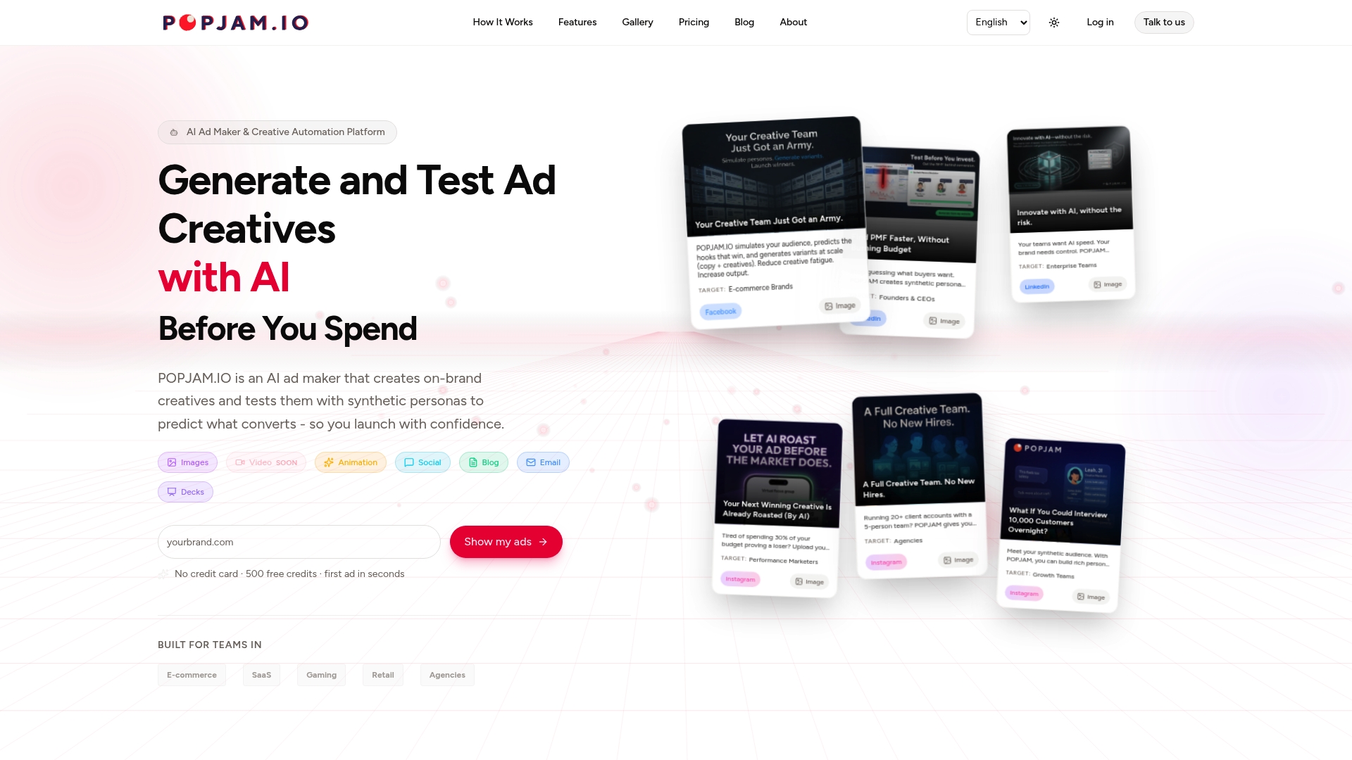
Instead of guessing which of your twelve concepts deserves the ad spend, some AI tools generate on-brand variants and run them against synthetic buyer personas first. You get psychographic feedback on what resonates before launch, not a post-mortem after the budget’s gone. That’s the practical difference between a testing framework you read about and one you actually run every week without burning creative hours on every version.
If you’re building creative volume for ecommerce campaigns and want to see which variants would land before they go live, start with the AI ad generator built for creative testing and run your next batch through it before your next launch.
Sources
- eCommerce display creatives - Guidelines & ad specs | Amazon Ads
- 10 Best Examples of Ecommerce Product Video Marketing (2026)
- Digital 2023: Deep-dive time spent on social media | DataReportal
FAQ
What are the best ecommerce ad creatives right now?
Short product-first video under 30 seconds, UGC-style testimonials, and carousel formats for multi-SKU storytelling consistently outperform long-form or overly polished brand film.
How long should an ecommerce video ad be?
Keep most video creative under 45 seconds, and aim for 15 to 30 seconds specifically for social placements, where attention drops off fast.
How often should I refresh ad creatives?
Most practitioners refresh every 4 to 6 weeks to stay ahead of creative fatigue before performance starts declining.
Should I test video and image creatives together?
No. Segment them into separate ad groups, since mixing formats in one test confounds the results and hides the true winner.
Can AI actually improve ecommerce ad creative performance?
Yes. Amazon’s internal data found a 14% average CTR lift for responsive creatives using AI optimization, and platforms like POPJAM extend that by pre-testing variants against synthetic audiences before launch.